Ecommerce
Dishing Up Confident Clicks
Nourishing Connections with E-Commerce Platform for Seniors

Ecommerce
Dishing Up Confident Clicks
Nourishing Connections with E-Commerce Platform for Seniors
Ecommerce
Dishing Up Confident Clicks
Nourishing Connections with E-Commerce Platform for Seniors
Overview
Role
UX UI Designer
Date
January 2023
Scope
Market Research, Competitor Audit, Information Architecture, Wireframing, UI Designing, Prototyping, Testing
Overview
Role
UX UI Designer
Date
January 2023
Scope
Market Research, Competitor Audit, Information Architecture, Wireframing, UI Designing, Prototyping, Testing
Overview
Role
UX UI Designer
Date
January 2023
Scope
Market Research, Competitor Audit, Information Architecture, Wireframing, UI Designing, Prototyping, Testing
Project Summary
TopNoshMeals, offers nutritional home-cooked meals to seniors, retirees, Home Care Package, and NDIS recipients in Northern Brisbane and the Sunshine Coast. They aimed to transition to ecommerce with a website that addresses challenges such as building trust in online ordering, catering to limited technical abilities, and ensuring accessibility for their target audience.
Objectives
The project aims to transition customers to online ordering, expand the customer base, and create an accessible website following WCAG guidelines, without alienating users. Balancing accessibility, user experience, and organisational goals to ensure a smooth transition for all users.
Problem
How can TopNoshMeals smoothly transition its ordering system to an online platform, addressing trust, technical, and accessibility challenges for seniors, retirees, and HCP/NDIS recipients in Northern Brisbane and the Sunshine Coast?
Problem
How can TopNoshMeals smoothly transition its ordering system to an online platform, addressing trust, technical, and accessibility challenges for seniors, retirees, and HCP/NDIS recipients in Northern Brisbane and the Sunshine Coast?
Problem
How might TopNoshMeals effectively transition its customer ordering system from traditional phone-based methods to an online platform, considering challenges related to trust, technical abilities, and accessibility for seniors, retirees, and recipients of Home Care Packages (HCP) and NDIS in Northern Brisbane and the Sunshine Coast?
Discover
Understanding User Needs and Challenges
Discover
Understanding User Needs and Challenges
Discover
Understanding User Needs and Challenges

Workshopping
Navigating Needs and Aspirations
The first step began with a workshop with the client and key stakeholders to gain full understanding of the scope and needs of the business and the desired out comes. From here we able to gage who their primary target audience and user was and create a list of questions that formed the base of our research.
Workshop Insights
1
Expand Customer Base
Increase the number of customers while retaining existing ones.
1
Expand Customer Base
Increase the number of customers while retaining existing ones.
1
Expand Customer Base
Increase the number of customers while retaining existing ones.
2
Develop an Accessible Website
Create a user-friendly website that adheres to WCAG guidelines to accommodate users with diverse technical abilities and accessibility needs.
2
Develop an Accessible Website
Create a user-friendly website that adheres to WCAG guidelines to accommodate users with diverse technical abilities and accessibility needs.
2
Develop an Accessible Website
Create a user-friendly website that adheres to WCAG guidelines to accommodate users with diverse technical abilities and accessibility needs.
3
Alienating Existing Customers
Transition to a digital platform without losing the trust and engagement of current customers, including seniors accustomed to phone-based ordering systems.


User Research
Discovering User Insights
To gain insights into user behaviour, both primary and secondary research was conducted. Research methods included user surveys, internal feedback and qualitative analysis of both primary and secondary sources. Insights gained identified common themes like accessibility and personalisation, which led to the development of psychographic analysis and user personas. Competitor analysis was also done to gain insights into industry standards.
User Research
Insights and Observations
Based on the research these insights collectively inform the design process, guiding the development of the project.
User Research
Insights and Observations
Based on the research these insights collectively inform the design process, guiding the development of the project.
User Research
Insights and Observations
Based on the research these insights collectively inform the design process, guiding the development of the project.
1
Ordering Behaviour
Users prefer phone-based ordering due to familiarity and comfort.
Certain user groups experience digital apprehension, requiring user-friendly interfaces for online transition.
Emphasis on transparent and clear communication to address security concerns.
1
Ordering Behaviour
Users prefer phone-based ordering due to familiarity and comfort.
Certain user groups experience digital apprehension, requiring user-friendly interfaces for online transition.
Emphasis on transparent and clear communication to address security concerns.
2
Community-specific Challenges
Seniors and retirees encounter unique navigation challenges online, necessitating tailored designs.
Accessibility is vital, especially for users with limited technical abilities, demanding intuitive interfaces.
Personalised communication strategies are essential to meet diverse community needs.
3
Research and Analysis
Accessibility and personalisation are critical for user experience, demanding inclusive design practices.
Understanding psychographics, such as age-related vulnerabilities, Health, brand loyalty, social engagement, and security concerns play significant role.
3
Research and Analysis
Accessibility and personalisation are critical for user experience, demanding inclusive design practices.
Understanding psychographics, such as age-related vulnerabilities, Health, brand loyalty, social engagement, and security concerns play significant role.
4
Competitor Analysis:
Streamlined ordering processes and standardised pricing enhance user experience.
Adhere to WCAG guidelines, prioritise essential details, with step-by-step guidance and customer support.
Clear communication fosters trust and confidence, improving user satisfaction.
4
Competitor Analysis:
Streamlined ordering processes and standardised pricing enhance user experience.
Adhere to WCAG guidelines, prioritise essential details, with step-by-step guidance and customer support.
Clear communication fosters trust and confidence, improving user satisfaction.
Problem Statements
3 key problem statements were quantified based on the research findings.
Problem Statements
3 key problem statements were quantified based on the research findings.
Problem Statements
3 key problem statements were quantified based on the research findings.
1. Accessibility
The diverse technical abilities and preferences among the primary target users, including seniors, retirees, and recipients of Home Care Packages (HCP) and NDIS, underscore the need for a website design that addresses accessibility challenges comprehensively.
1. Accessibility
The diverse technical abilities and preferences among the primary target users, including seniors, retirees, and recipients of Home Care Packages (HCP) and NDIS, underscore the need for a website design that addresses accessibility challenges comprehensively.
1. Accessibility
The diverse technical abilities and preferences among the primary target users, including seniors, retirees, and recipients of Home Care Packages (HCP) and NDIS, underscore the need for a website design that addresses accessibility challenges comprehensively.
2. Customised Pricing
As a partner with NDIS and HCP, Top Nosh Meals offers personalised pricing based on users' provider plans and eligibility. However, the variability in prices may lead to user confusion and abandoned carts, necessitating a clearer and user-friendly approach to pricing information.
3. Confidence
Users, especially those accustomed to a phone-based ordering system, express concerns and lack confidence in transitioning to an online platform. Apprehension and security concerns surrounding the online ordering process may hinder user adoption and engagement.
3. Confidence
Users, especially those accustomed to a phone-based ordering system, express concerns and lack confidence in transitioning to an online platform. Apprehension and security concerns surrounding the online ordering process may hinder user adoption and engagement.
3. Confidence
Users, especially those accustomed to a phone-based ordering system, express concerns and lack confidence in transitioning to an online platform. Apprehension and security concerns surrounding the online ordering process may hinder user adoption and engagement.
Define
Mapping Out Boundaries and Deliverables of the Design Project
Define
Mapping Out Boundaries and Deliverables of the Design Project
Define
Mapping Out Boundaries and Deliverables of the Design Project

User Journey
A Roadmap to Seamless Experiences
Developing the user journey is essential for creating a seamless experience. By mapping out the user's path from initial interaction to goal completion, designers can identify pain points and enhance satisfaction. This process ensures intuitive navigation, personalised touchpoints, and clear steps that instill confidence, encouraging users to register/login for a customised experience. Additionally, information markers provide context and guidance, further boosting user confidence.
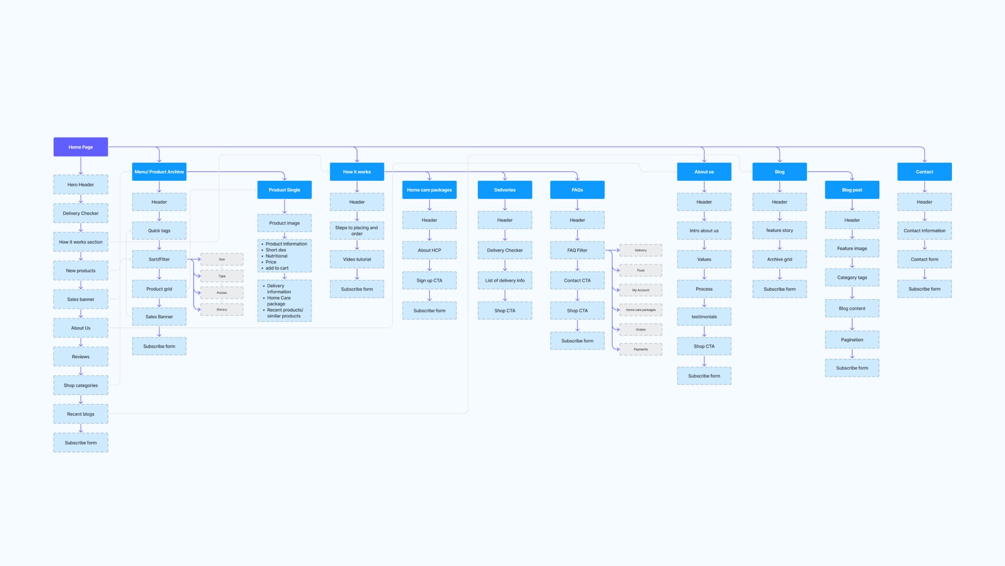
Information architecture
Structuring the Hierarchy
The information architecture was design based on the sitemap and user journey. The information architecture works as frame work to expand on the user journey and understand the content that is need for the content strategy.
Information architecture
Structuring the Hierarchy
The information architecture was design based on the sitemap and user journey. The information architecture works as frame work to expand on the user journey and understand the content that is need for the content strategy.
Information architecture
Structuring the Hierarchy
The information architecture was design based on the sitemap and user journey. The information architecture works as frame work to expand on the user journey and understand the content that is need for the content strategy.
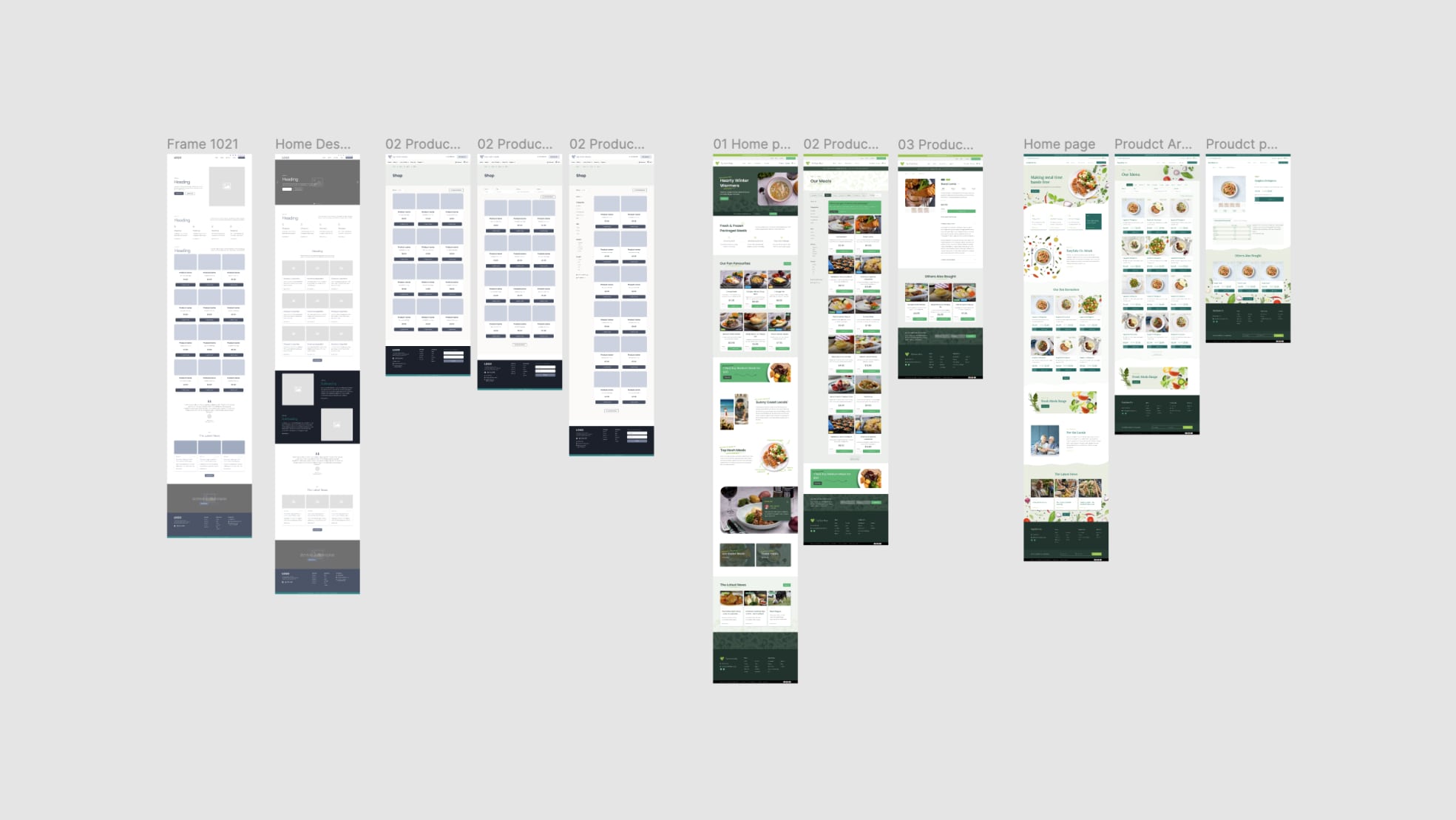
WireFraming
Exploring Design Solutions
Guided by the information architecture and user flows, this phase involved the rapid creation of wireframes to test low-fidelity design solutions. Wireframing provided a structured framework to explore various design concepts and layout arrangements. During this phase the application of the visual design and brand guidelines began to be explored.
Design
Bring Visual Interfaces Concepts to Life
Design
Bring Visual Interfaces Concepts to Life
Design
Bring Visual Interfaces Concepts to Life
WireFraming
After the approval of the Information architecture and the selected visual design concept, high-fidelity prototypes were initiated, building upon the wireframes. These prototypes aimed to translate the conceptual designs into detailed, pixel-perfect representations of the final product.
WireFraming
After the approval of the Information architecture and the selected visual design concept, high-fidelity prototypes were initiated, building upon the wireframes. These prototypes aimed to translate the conceptual designs into detailed, pixel-perfect representations of the final product.
WireFraming
After the approval of the Information architecture and the selected visual design concept, high-fidelity prototypes were initiated, building upon the wireframes. These prototypes aimed to translate the conceptual designs into detailed, pixel-perfect representations of the final product.
Styles
Styling for Usability & Accessibility
To effectively address the accessibility challenges highlighted in problem statement 1, it was vital that the final design meet WCAG guidelines. High colour contrast that meet AAA ratings. A type Scale: 1.333 with a base of 18 was chosen for medium contrast typography to ensure legibility for users with different vision impairments.

Navigation
Crafting Intuitive Pathways
The navigation system prioritises simplicity and clarity, ensuring effortless access to essential information. By replacing hover states with clickable menu items on desktop, we enhance usability, particularly for users with mobility challenges, in line with WCAG guidelines. Breadcrumbs are strategically employed across the site to aid user orientation during navigation.
Visibility
Enhancing Information Clarity
The site prioritises content visibility and scannability by removing obstructive swipes and hover gestures. Selector buttons replaced drop-down menus for quantity adjustments on the product page, while expanded click and tap points improved navigation, particularly for users with limited dexterity or visual impairments.
Responsive Design
Consistency Across Devices
Ensuring adaptability and responsiveness across devices is crucial for accessibility. The approach priorities seamless access on all devices, maintaining consistency with larger Ui Elements. Incorporating alt text for images, we enhance accessibility, particularly for users with limited eyesight.
Microinteractions
Improving User Feedback
Microinteractions, like animations for adding items to the cart and subtle transitions during login, enhance the user experience by providing visual feedback for successful actions throughout the Site.
Microinteractions
Improving User Feedback
Microinteractions, like animations for adding items to the cart and subtle transitions during login, enhance the user experience by providing visual feedback for successful actions throughout the Site.
Microinteractions
Improving User Feedback
Microinteractions, like animations for adding items to the cart and subtle transitions during login, enhance the user experience by providing visual feedback for successful actions throughout the Site.
Guiding Interactions
Supporting the User Journey
To address digital apprehension, the design includes supportive elements like modals, callout boxes, and info panels to guide users through the site and ordering process. Clear instructions on the home page and a dedicated 'How It Works' page, with detailed instructions and video tutorials, boost user confidence and understanding.
Customised experience
Addressing Complexity with User Registration
The site caters to new and existing customers, as well as guests, each with unique technical capabilities. It aims to provide necessary information without overwhelming experienced users. Encouraging users to log in or register upon arrival, along with cached data utilisation, addresses customised pricing complexities. The delivery checker plugin verifies user addresses and eligibility, encouraging new users to register before shopping and access relevant tutorials.
Encouraging users to log in or register before shopping grants access to customised pricing based on NDIS or HCP plans. Product cards initially display the full price, with markers indicating the Home Care Package (HCP) price upon user login and HCP provider registration. This approach serves as a reminder for existing users to log in and prompts new users to subscribe.
Encouraging users to log in or register before shopping grants access to customised pricing based on NDIS or HCP plans. Product cards initially display the full price, with markers indicating the Home Care Package (HCP) price upon user login and HCP provider registration. This approach serves as a reminder for existing users to log in and prompts new users to subscribe.
Encouraging users to log in or register before shopping grants access to customised pricing based on NDIS or HCP plans. Product cards initially display the full price, with markers indicating the Home Care Package (HCP) price upon user login and HCP provider registration. This approach serves as a reminder for existing users to log in and prompts new users to subscribe.
Checkout Confidence
Improving Clarity and Direction in Checkout
The checkout process was streamlined due to limitations with the WooCommerce default checkout. Implementing a multi-step checkout reduces cognitive load and improves user guidance, clarifying the purpose of each step and required actions. This approach also aids in error isolation, simplifying troubleshooting and minimising user frustration.


Validating
Measuring Website Performance and User Feedback
Validating
Measuring Website Performance and User Feedback
Validating
Measuring Website Performance and User Feedback
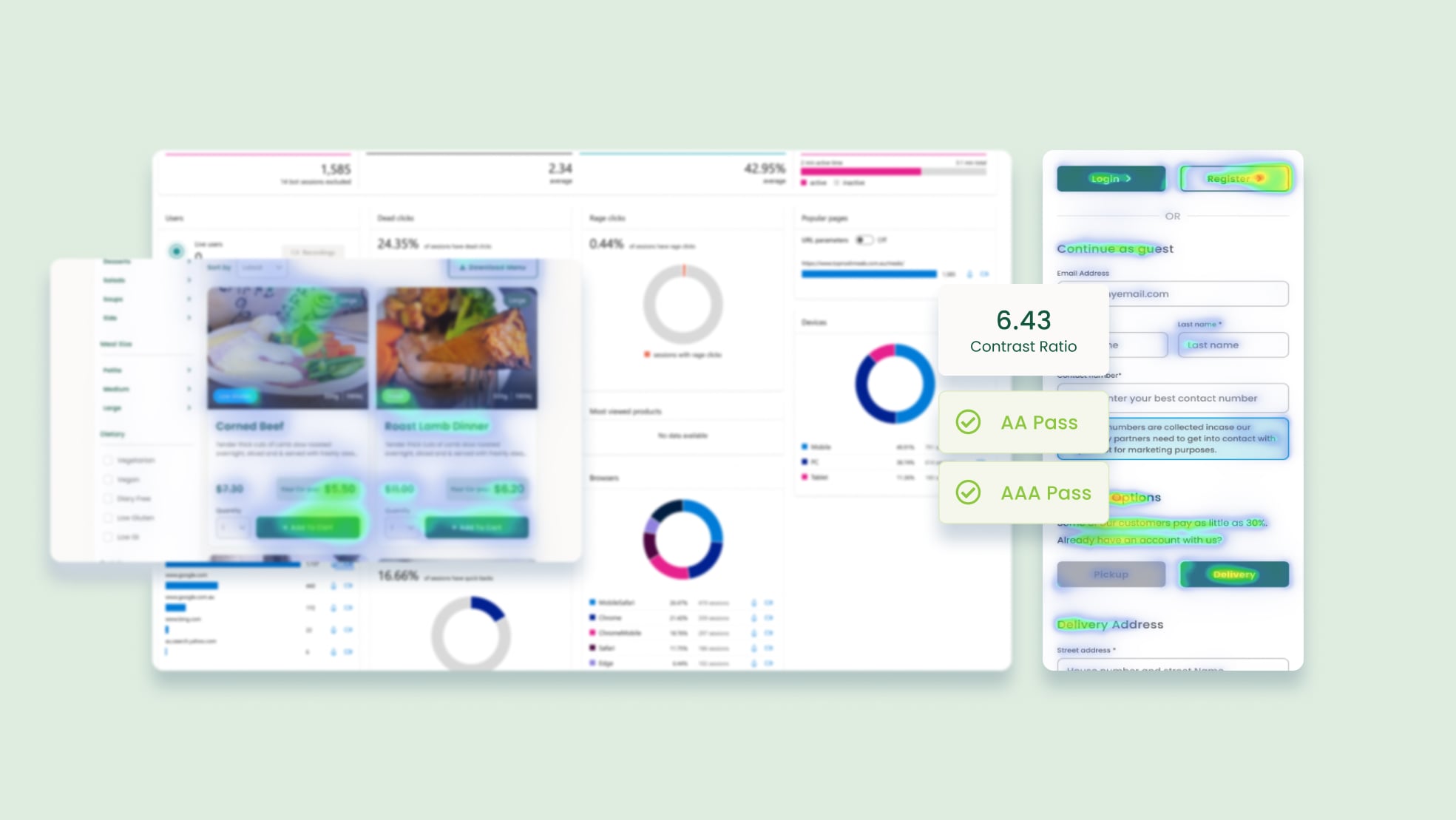
Testing and Iteration
Observations and Design Solutions
Tools like Microsoft Clarity and gathering direct user feedback provided valuable insights into user behaviour and preferences. While the website achieved a commendable Lighthouse score of near perfect, further adjustments are required to meet alt text requirements for improved accessibility. The following observations where recorded when analysing heat maps, user sessions and direct user feedback.
Insight and Observations
1
Delivery Information
Guest customers continued to shop and add items to cart only to be outside delivery zones at checkout, causing frustration.
1
Delivery Information
Guest customers continued to shop and add items to cart only to be outside delivery zones at checkout, causing frustration.
2
Quick Add-to-Cart
Users preferred quick add-to-cart feature on product listing pages rather than click through to individual product.
2
Quick Add-to-Cart
Users preferred quick add-to-cart feature on product listing pages rather than click through to individual product.
3
Increased Order Volume
Online orders saw a boost in total order volume compared to previous phone-based ordering.
3
Increased Order Volume
Online orders saw a boost in total order volume compared to previous phone-based ordering.
4
Phone-Based Customer Transition
75% Phone-based customers successfully shifted to online ordering.
4
Phone-Based Customer Transition
75% Phone-based customers successfully shifted to online ordering.
5
Price Transparency
Some users expressed frustration when HCP Discount weren’t eligible on their order and the listed price remained the same after registration.
5
Price Transparency
Some users expressed frustration when HCP Discount weren’t eligible on their order and the listed price remained the same after registration.
Next Steps
Observations and Design Solutions
Tools like Microsoft Clarity and gathering direct user feedback provided valuable insights into user behaviour and preferences. While the website achieved a commendable Lighthouse score of near perfect, further adjustments are required to meet alt text requirements for improved accessibility. The following observations where recorded when analysing heat maps, user sessions and direct user feedback.
Previous Project
Next Project
Previous Project
Next Project